-
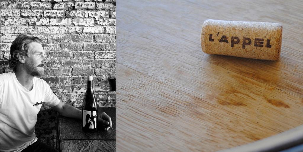
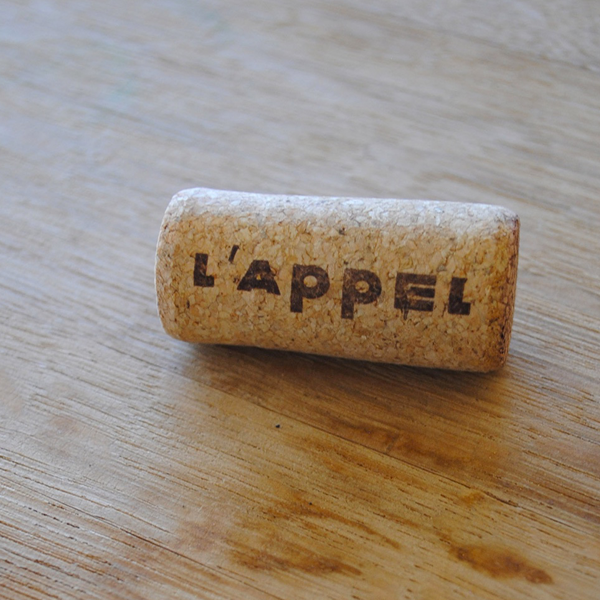
L’appel Wines
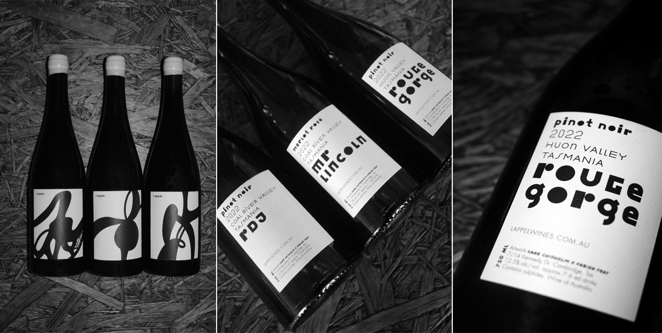
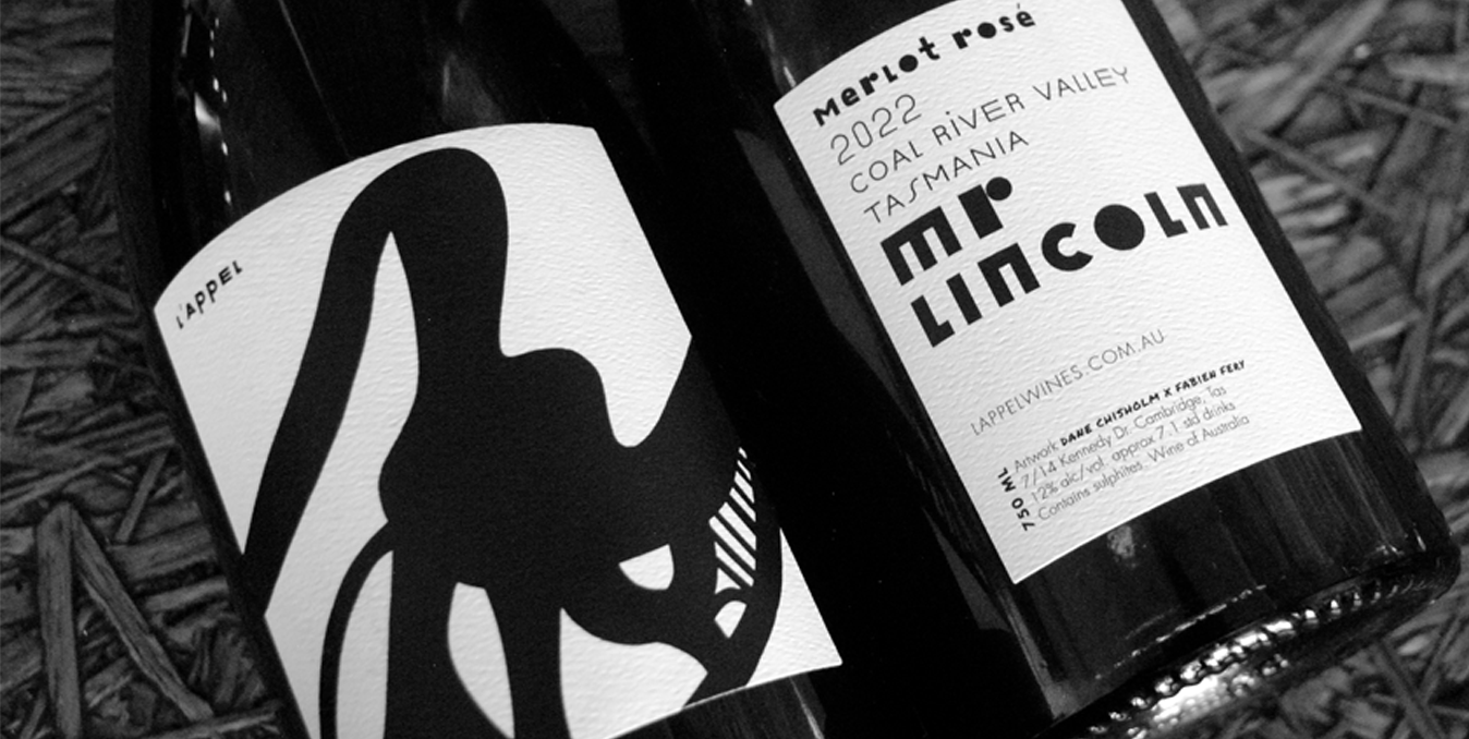
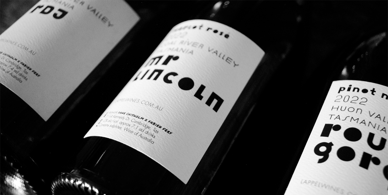
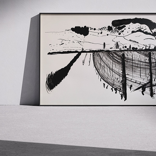
L’appel wine: a new Tasmanian wine identity: The request was precise, it was a question of highlighting the identity of the wine (variety, vintage, region, Area and the cuvée) through a pure and radical design. A request has been made to renew the graphic identity of L’appel wines. The first work for the year 2022 was to propose a new logo and define the design of the new bottle labels. Three new labels exactly for two Pinot Noir and a Merlot rosé. The choice of typography played an essential role in this project. The final proposal was to use the “Julien” typography created in 2011 by the fantastic typographer Peter Bilak. The choice of this typography was decided for two reasons: the first, it dialogues with the black and white drawing previously made by Dane Chisholm on the front label of the bottle and the second reason, it can be transformed according to the settings that we make it a visual in its own right, a drawing all by itself. Indeed, Julien is a playful geometric display typeface loosely inspired by the early 20th century avant-garde. It is based on elementary shapes and includes multiple variations of each letter. Julien’s font was also used for the redesign of the L’appel logo.